


@alisha
Well-Known Member
- Joined
- Sep 29, 2012
- Messages
- 4,063
- Reaction score
- 21
I am proposing to improve current layout for Product page, as for now major problem is -> BuddyStore current design do not utilize space good enough.
To be clear, i want to admit this is only 5 minutes draft, if i will know it will be useful and can be implemented i will ask my husband to draw more clear solution.
Why it's important:
In general it should qualify from design perspective BuddyStore as more professional place: layout have psychology influence of how user think of current web-site, if it think it's professional, or if it think it can trust it.
It should associate as: active place, where things happen, where we have huge community, support and user can trust us.
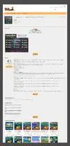
Proposal Product Page view:

Current Product Page view:
Small size comparison space usage:
To be clear, i want to admit this is only 5 minutes draft, if i will know it will be useful and can be implemented i will ask my husband to draw more clear solution.
Why it's important:
- Give users ability to see more in one monitor screen without scrolling
- Divide things by priority: more important closer to top, less important closer to bottom.
- Retrieve back iframe (or how it was realized, didn't pay attention on code those day) for Product description (it's easer to use small scroll bars to list description of product while the whole page on same place.
- Give ability to add Pictures for Product, so we wont be affected to forum problems (like it was recently with some attachments gone in eternity), provide for user best solution to view screenshots -> via Javascript library like this one: http://photoswipe.com/
- Add contacts and links to support to increase the level of trust to the BuddyStore, from marketing perspective having contacts in page of Purchase will increase % of purchaces, because users will feel self more protected and web-site as more trusted.
- Provide more information about available payments variants for user before he clicks "buy" button -> will motivate him to buy if he will see familiar or often use purchase system.
- Adding secure icon (image) will add trust to web-site purchase process.
- Payments system logotypes should be shanged to most known all over the world -> so most % of ppl they will be familiar with. I do not aware such information currently so those on deisgn just examples
- Add navigation *bread crumbs* for better user navigation over Store
- Add Help Desk link -> many users actually suffer for finding it. Actually this link should be also added to top of forum as it's really hard to find in searching wiki etc.
- Attention for communication methods will also increase trust level and motivate to purchase products
- Remove "Read more button" to read description of product -> replace back with scrolls instead
In general it should qualify from design perspective BuddyStore as more professional place: layout have psychology influence of how user think of current web-site, if it think it's professional, or if it think it can trust it.
It should associate as: active place, where things happen, where we have huge community, support and user can trust us.
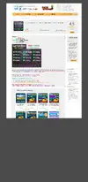
Proposal Product Page view:
Current Product Page view:
Small size comparison space usage:
Attachments
Last edited: