What's new
  • Visit Rebornbuddy
  • Visit Panda Profiles
  • Visit LLamamMagic
  • Visit Resources
  • Visit Downloads
  • Visit Portal

Latest Store Changes (Recently Updated Products)

Studio60

Well-Known Member
Joined
Sep 3, 2014
Messages
3,411
Reaction score
19
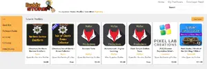
Last night a change was made to the store, implementing a "Recently Updated Products" view/list to the store and I have to voice my opinion on it, which will not make me popular with the staff. Sorry for that in advance. The feature itself is good, but the implementation surrounding it is really bad. As with most store changes, there was very limited opportunity for developer input. If you are not online the moment the decision and change is made you basically have to watch it happen.

With the way the store is structured it is apparent you don't have someone on board that is experienced in ecommerce. I have designed online shops for many years and I can tell you that "quick and neat changes" can dramatically impact sales in a negative way. The store could pull in so much more money if you were to actually implement a few key mechanics instead of playing with features every few months that you come up with on a whim. There are a lot of great changes that could be made, but those would require customer metrics you probably don't have, so I will stick to the basics. The changes I propose lead to more sales which means more money for Bossland AND the community developers. Bossland always states how the store makes him lose money. Well, then he needs to get the store in shape if he wants it to perform better. This is nothing to take easy or work on without a solid plan. Ecommerce requires knowledge.

  1. New products are essential to keep sales up. We all know the sales curve of new products and they have to stay in the first position on the landing page, not in the second after recently updated products. People are drawn to new products. That is basic psychology and entices early adopters to buy which you need to get late adopters to even recognize a product. If early adopters don't buy, nobody does.
  2. Customers need to be feel that the store is dynamic and breathing. The newest 7 (used to be top 5) products on the landing page should be randomly chosen from like the newest 20 to 25 products so that the page does not look static for a week at a time and then suddenly changes once for another week. It also has a benefit for community developers to not be pushed off the front the page by other new products on the same day just because someone submitted their products an hour after you.
  3. The new rule that "Release version submissions are now limited to be submitted every 3 days." is bad for business. This rule kills hotfixes and every new product has these hidden, but breaking bugs. Asking us to test more during beta is not the solution and every software developer can tell you this. What is required is a flag on the submission form to differentiate between "bugfix updates" and "feature updates". Feature updates are worthy of being in "Recently Updated Products" and can be throttled to even once a week, while bug fixes are just necessary in software development and good business behavior by developers. Developers should select the option and testers should be able to change it during approval if the developer misjudged.

Yes, this is some more work to develop, but if you want to do it the right way, that's the way to go.
 
Last edited:
I also do not like the new 3 days rule, if it stays, there should be either an "exception token" once/twice a month that you can use for "emergency hotfixes" or an option to roll back to a prev. version of the product.
If something is broken and made it through testing/beta to release, waiting 3 days is not acceptable.
 
If Raphus does not want a manual process involved, he could just add a "hidden timestamp" that makes the product "go on cooldown for the recently updated product list" whenever it has been in in it. Just add a database field "PromotedUpdateTimestamp" which is used to order recently updated products and which is only set to DateTime.Now on approval if the current value of PromotedUpdateTimestamp is older than X days. Takes very few lines of code and enables us to still provide good service without enforcing some rule that harms paying customers.

Sidenote; The number of products per category on the front page should be reduced back to 5. Showing too many products leads to "analysis paralysis". People being overwhelmed with choices buy less. This has been extensively researched. Better to rotate the products on the front page than to show too many products at once.
 
Last edited:
Totally agree with: (1) and (3).
New products always should be 1st line, and limiting new versions, fixes etc cause this new feature "Updated products" on first page - is really bad idea, It should be plus and not minus to have this new row on shop.

Partly with (2): bad thing of current approval system, that Core Devs which do approves do not have much time (which is reasonable) and all approvals are made on ~same time, so if more than 7 products are on approval, mean - part of them never will see first page or will see it on few min-hours (i am talking about new products), tho other can stay on it till next approval (for week or even more).
 
Agree with Studio on this.

Store Appearance:
There's too much going on now on the home page for the store.

The store is already modelled after Google's Play store. It should follow some of their standards - they'll have done incredible amounts of market research to get to where they are.

"New + Updated Products"
"Popular Paid Products"
"Popular Free Products"

Nice, clean, and simple:

m3aJDQW.png


3 Day Rule:

- Not all bugs are found during testing. It doesn't matter how much you test something, someone will find a bug somewhere. Urgent fixes are necessary in all walks of life, the buddy store is no different.

- It will create a culture of pushing changes every 3 days to ensure products are advertised more, instead of pushing changes in bulk. You can state 'whitespace changes aren't allowed', however I can change a spell condition from "toon power > 3" to "toon power > 3.2" - tiny change, but justifiable as "tuning".

- The rule "Attempts of submitting small changes to stay on top might result in temporary ban of new submissions up to a month" only hurts the end users who have purchased the products. Nothing good can come from this. This would also vastly increase the number of product refunds.
 
Thanks for raising your concerns. As Studio said we are not experienced in ecommerce and our actual job is to write bots. I'm always open to the suggestions


  • I will move New products back to the top and recently updated to be second.
  • We have already discussed that submission ban would only hurt users and decided to unlist products from the store for x days depending on the intensity of the abuse. That way it is only the developer that gets hurt
  • As Millz mentioned, I've chosen google play as the base design and extended that for our needs. I will try to make product boxes more compact for a more clean look.
  • We also already discussed with Highvoltz to add an option to submit release versions for emergency fixes that doesn't make the product show in Recently updated list. I'm also thinking about adding a third option for *critical* submissions which would move the product top of the pending approvals list and speed up the approval for it. However that would be limited to once every 2 weeks or such
 
Last edited:
Thanks for raising your concerns. As Studio said we are not experienced in ecommerce and our actual job is to write bots. I'm always open to the suggestions


  • I will move New products back to the top and recently updated to be second.
  • We have already discussed that submission ban would only hurt users and decided to unlist products from the store for x days depending on the intensity of the abuse. That way it is only the developer that gets hurt
  • As Millz mentioned, I've chosen google play as the base design and extended that for our needs. I will try to make product boxes more compact for a more clean look.
  • We also already discussed with Highvoltz to add an option to submit release versions for emergency fixes that doesn't make the product show in Recently updated list. I'm also thinking about adding a third option for *critical* submissions which would move the product top of the pending approvals list and speed up the approval for it. However that would be limited to once every 2 weeks or such

I think New and Updated should be merged on the front page, with separate categories to drill down into for "New" and "Recently Updated". Most store websites will have select products on the main page, but a drop down box with sorting options "Recently Updated", "Price (High to Low)", "Price (Low to High)", "Most Popular (All Time)", "Most Popular (Weekly)" etc.

The 'submission ban' just feels bad. Studio's idea of an internal timer to only be allowed a *bump* every ~3-5 days is better, then it doesn't rely on someone having a bad day going through banning everything. This will only force developers away from the buddy store onto other platforms.

I like the idea of a critical submission option. I wouldn't put a time limit on it though (this just means devs will PM people on skype instead). Have some faith that it won't be abused. If it is abused, remove the option from the dev involved. Where the 'emergency' option is selected, add a requirement to justify why it's an emergency, i.e. "product is causing HB to crash under x circumstance".
 
Thanks for raising your concerns. As Studio said we are not experienced in ecommerce and our actual job is to write bots. I'm always open to the suggestions

Thank you for addressing my concerns. It gives me the good feeling of actually being heard.

About Millz suggestion of merging "New and Updated": That would only work if the pool of those products would be somewhat randomized as I suggested before (random 5 out of 20 newest) for example and it would require a differentiation between minor updates and feature updates.

Opening up the ability to request critical updates is good, but as Millz said, it would probably be better to "ban" individual developers for abuse instead of just throttling it across the board.

And as it stands now, 7 products per row are too many. The eye can't focus on any, because the images are glued together. Google Play does have more products per row, but as you said before, they are indeed presented in a cleaner fashion because of the spacing. Should you consider reducing the size of the product images, please give us some notice so we can prepare new versions.
 
Last edited:
New store design has been published. Let us know your thoughts about it.


With the new design the product icons have been lowered to 165x165 pixels. Current icons are now scaled down
to fit. Edit product page now allows submitting icons larger then 165x165 pixel images which are squares.


The 3 day limit for release version submissions is also lifted. Instead of that the products will only be promoted
in Recently Updated Products tab when a new release version has been approved 3 days after the previous one.
 
I am quite pleased with this, so good job!

But I have one more issue:

9eHwjPs.png


Many profile developers use the product name to create a directory structure in the "Load from Buddystore" dialog. I for example use it to order my products by category and expansion.
But with this one product name filling two purposes, we end up with either an ugly product name or a bad directory structure.

Is there a way we can split the product name into two values?

1. One string that is displayed as the product name
2. Another string that is used in the profile browser dialog for the path
 
I, personally, would like to see the addition to the search function to be able to search for products matching search parameters from descriptions. If I search for "Hallow's End" I would love to see all products that mention it in their descriptions, instead of just their titles. This would allow package deals to be more noticeable instead of just individual products. Or if we choose a different naming scheme than just "what the product does" in the title.
 
I, personally, would like to see the addition to the search function to be able to search for products matching search parameters from descriptions. If I search for "Hallow's End" I would love to see all products that mention it in their descriptions, instead of just their titles. This would allow package deals to be more noticeable instead of just individual products. Or if we choose a different naming scheme than just "what the product does" in the title.

Searching the whole product description might be a bit taxing on the query, but keywords would be nice to have.
 
Agree, 3 line for product name should be.

My suggestions for design adjustment:
1) Store path, like "Quest Bot Farming Profiles" should be smaller and maybe gray color, as it do not really matter for user and not important as product have direct link, so height of card can be decreased
2) Price better to be colorize -> green for max effective, as this color associate as confidence and the positive, according marketing it's will give better perception of product price.
3) New design is cleaner which is better than it was before
4) author name should be more readable color

My Variant:

attachment.php


Current Realization:

attachment.php


Attaching style.css, just in case
 

Attachments

  • 2015-10-28_033917.webp
    2015-10-28_033917.webp
    65.3 KB · Views: 50
  • 2015-10-28_033014.webp
    2015-10-28_033014.webp
    68.6 KB · Views: 48
  • style.zip
    style.zip
    18.3 KB · Views: 1
Last edited:
I like Alisha's suggestions a lot. Price coloring is a good idea and setting back the category (because it is not very important) is also good. For the names I still think my suggestion is better to split it off from the store path and have an actual display name where we might even be able to add a line break ourselves.
 
Please could you move 'Popular Paid in...' & 'Popular Free in...' sections to the top of each page.

These are two of the most important sections yet you have to scroll down to the bottom to see them on each page?
 
It also will be good to see "bread crumbs" as help for navigation and better understanding for user where is he now, which will be displayed only on sub pages, not on main page.


attachment.php
 

Attachments

  • 2015-10-29_060935.webp
    2015-10-29_060935.webp
    58.7 KB · Views: 29
I am going to disagree with you there. I think New and Updated should be at the top. It inspires innovation and new products. It also inspires people to update their current products along with giving the customer an easy way to see what has been updated. Popular is nice and all, but it doesn't help new products get sold or help the customers get updates.
I can see many people just pushing updates just to stay on top even though they have not actually updated anything?
 
Back
Top