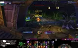
After 3 days of writing, rewriting and scripting things, I have a new UI!

Info:
So the unit frames are now a little more intuitive. The bottom left is the new chat (with a new font to make it a little easier to read). Then the map, which is now able to autozoom in tight spaces and is a little more descriptive. Then my ...action bars are located with a casting bar above it. The small square to the right of the casting bar is the party frame. The party frame when in a group shows all members sorted by class and gives a (+ / - #) for their health and flashes red when in danger /gray when dead. Bottom right is the pet action bar. Far right is Damage and DPS per second. Above that is the cool down bar.
The cooldown shows all abilities and trinkets, when the come off cooldown to maximize your DPS. The top bar shows money, performance (FPS) location, etc. Top right shows buffs. The middle shows the 6 most commonly used abilities for rotation. They include cast order and trinkets so you dont have to sort through bars, you just cast what you need and focus on the middle 6 buttons to max DPS. Left are spec buffs (back draft, etc) Right is the time remaining on my dots.
One last thing is that whenever an ability comes off cooldown it pops up between the cast bar and the 6 buttons in the middle to notify me. This helps keep things rolling and casting with ease. All incoming messages open up as AIM style pop up boxes that contain the whole conversation. I think that's about it...
last thing - I promise. When you go into metamorphisis, i scripted that 6 button bar in the middle to fade out and a new one pops up in it's place with all the demon abilities, when you switch back, the new one fades away and the old one comes back. This little project took 3 days btw


